Forum:Creature template idea - please read: Difference between revisions
imported>Arkalor No edit summary |
imported>Arkalor No edit summary |
(No difference)
| |
Latest revision as of 10:53, 17 February 2013
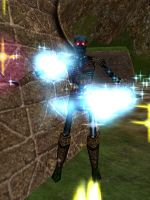
Could we think about changing the creature template and making it simpler please. I think we should utilise the stats panel as it already has the creature's image allowing us to basically document most of the details in one image (taking standardized xp rates and creature levels into account, oh and possibly loot tiers soon).
If you look at other mmo wikis (DDO and LotRO for example) they only have to upload the live image and nothing else. But we have to do two things and it's so freaking time consuming and tedious. I really think we should take advantage of the ID panel.
Please reply with your thoughts !
thanks. --Arkalor 03:27, 13 February 2013 (EST)
ps. sorry for gutting your nice template Tlosk.
Advantages
- Less time spent adding/editing!
- Much easier to retrieve ingame than a live image (can do from safe distance and easily using the Swiss tool).
- No need to fill out stats in template.
- Less images to store on server and smaller dump size.
- Doesn't spoil the ingame "surprise" as much.
...alternatively, live images (and future live images if people really want to spend the time adding them) could be kept as extras and as part of a gallery (see below).
Disadvantages
- Not as nice looking as live images with stats.
- Image is rather flat looking and doesn't show scale (though most live images don't either, really).
- ...err, probably more I haven't thought of
Introduced: Ancient Enemies Related Quests: Wight Blade Sorcerer Kill Task Wight Blade Sorcerer[[File:{{{Icon Image}}}]]- Value: ??
- Burden: ??
Notes
Images
Click image for full size version.
-
Caption
-
Caption
Yeah, this idea is not so great.
I thought we could work with fixed 300x520 stat panels instead of live images but I've just noticed that when you use the "stretch UI" character option the panel gets even longer and kind of ridiculous in size. Seems pretty obvious, but I've always used the small GUI (with 1024x768 window) as a prefer my compass at the top hence my small stat panels that I upload.I'm guessing most people won't want to shrink their interface/window everytime to get the panels for my idea :/
Example:
Standard UI Stretched UI 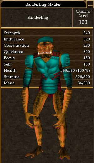
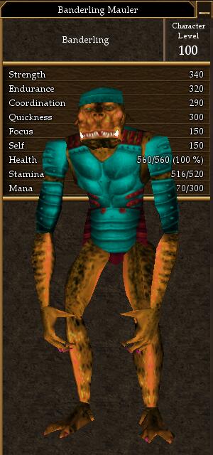
Standard UI (1280x1024) Stretched UI (1280x1024) 
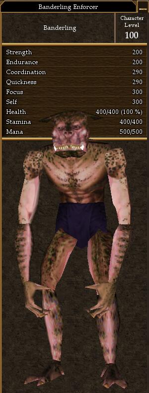
--Arkalor 23:33, 17 February 2013 (EST)
This was actually how they started out in the very beginning. And I can empathize with the time consuming aspect of working on creatures due the sheer volume of pages they comprise. One thing I might say for perspective (though if you're a completionist like myself I know it can cause some minor anguish to leave things blank) is that not all pages on a wiki deserve equal attention and don't worry about having incomplete info, that the less used data spots are just there so there's a place to put info that someone, at some point, thinks would be worth knowing. Though it's times like this I wish we had someone inside Turbine that could release data like this in a similar way they did back with the Sybex guides when they were under Microsoft.
On a related note my current version of the Wiki Swiss Tool can grab this information from the panel and prepopulate a template with it. I really need to set aside some time to finish a new release version up.
And one last note is that having this data in text form also allows us to grab the most current data from all pages and put them into the creature tables, something images would make much more difficult (once saved to jpg the artifacting makes OCR a lot more difficult).
--Tlosk 02:28, 18 February 2013 (EST)
Thanks for replying. Yes, I am not going to go out of my way anymore to get creatures done - especially if it means getting 10% vitae like last time in one of the newer dungeons haha.
That panel feature you mentioned sounds excellent. You mentioned grabbing data from all pages and putting them into tables; is this something I could do? or is it a script that you have made to do it?. I know you mentioned a similar thing for doing the weapon and armor pages a while back.
Also, are you going to be adding your map program into the tool someday with the "Ink Dungeon Maps" feature listed here. I would love to get some maps done.
You should a nice button for downloading your tool on the main page (I added a link for the tool page when I made some tweaks). I think we would get more people doing stuff if they knew about it.
--Arkalor 03:53, 18 February 2013 (EST)
- Less time spent adding/editing!
