User Interface: Difference between revisions
From Drunkapedia
imported>Arkalor |
imported>Arkalor |
||
| Line 22: | Line 22: | ||
|align=left valign=top rowspan=2| [[File:User-Interface 21.jpg|link=Inventory Panel#Container Slots|Open/Close Inventory]] | |align=left valign=top rowspan=2| [[File:User-Interface 21.jpg|link=Inventory Panel#Container Slots|Open/Close Inventory]] | ||
|- | |- | ||
|align=left valign=top| [[File:User-Interface 22.jpg|Use Selected | |align=left valign=top| [[File:User-Interface 22.jpg|link=Selected Target Bar|Use Selected Target]][[File:User-Interface 23.jpg|link=Selected Target Bar|Selected Target Bar]][[File:User-Interface 24.jpg|link=Examine Target Panel|Examine Selected Target]] | ||
|- | |- | ||
|align=left valign=top colspan=3|[[File:User-Interface 25.jpg|link=Inventory Panel#Shortcut Slots|Shortcut Slots]] | |align=left valign=top colspan=3|[[File:User-Interface 25.jpg|link=Inventory Panel#Shortcut Slots|Shortcut Slots]] | ||
Revision as of 19:39, 10 September 2012
Related topics: Game Mechanics, Commands, Character Login Screen
The Asheron's Call in-game tutorial, known as the Training Academy Quest, introduces you to many of the following components.
Visual Guide
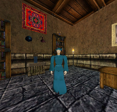
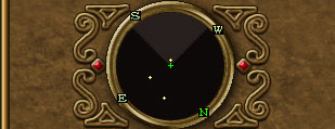
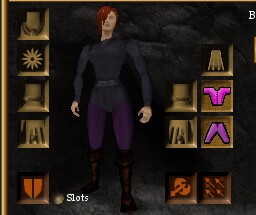
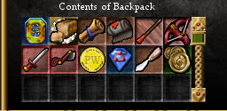
An example of the UI using the default settings and resolution of 800x600. Hover your mouse over areas of the screen for a description. Click an area for more information.
|
Components of the UI
| |||||||||||||
Notes
- During The Risen Princess event the sharing of Luminance can now be achieved across a fellowship. It's controlled under the same UI option as Xp, but the share range is drastically shorter.
- In the Throne of Destiny Expansion, the Asheron's Call UI received many new features and improvements:
- New interface skin.
- Pop-up dialogues.
- Instead of logging out and changing the keys from the login screen, keys are changed in-game using a large pop-up interface.
- Floating help system window that has branching, easy-to-navigate menus.
- The chat window can now be resized smoothly by clicking and dragging on its upper edge.
- To alert the player when new text has come in, a small, blinking arrow appears at the bottom of the chat box instead of automatically scrolling down.
- The status text, that used to appear in the top corner, has been moved to the top center, made red and enlarged.
- You now see a 3D model of any person or monster, instead of a small icon, when you view them in the Examine Target Panel.
- In the Castling event, keyboard binds for mapping a number of UI panels and character options were added.
- In the Friend and Foe event, a tooltip was added for when you have dragged an item over to another object, player or NPC in the 3D window, so you can be sure you're about to hand it to the right thing or person.
- In the Blood From Stone event, Mouse Turn & Movement was introduced.


