User Interface: Difference between revisions
From Drunkapedia
imported>Arkalor No edit summary |
imported>Arkalor No edit summary |
||
| Line 49: | Line 49: | ||
** [[Graphics|3D Display]] | ** [[Graphics|3D Display]] | ||
|} | |} | ||
== Notes == | |||
* In the [[Throne of Destiny]] Expansion, the Asheron's Call UI received many new features and improvements: | |||
** New interface skin. | |||
** Pop-up dialogues. | |||
** Instead of logging out and changing the keys from the login screen, keys are changed in-game using a large pop-up interface. | |||
** Floating help system window that has branching, easy-to-navigate menus. | |||
** The chat window can now be resized smoothly by clicking and dragging on its upper edge. | |||
** To alert the player when new text has come in, a small, blinking arrow appears at the bottom of the chat box instead of automatically scrolling down. | |||
** The status text, that used to appear in the top corner, has been moved to the top center, made red and enlarged. | |||
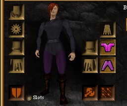
** You now see a 3D model of any person or monster, instead of a small icon, when you view them in the [[Examine Target Panel]]. | |||
[[Category:User Interface]] | [[Category:User Interface]] | ||
[[Category:Game Concept]] | [[Category:Game Concept]] | ||
Revision as of 13:09, 29 April 2012
Related topics: Game Mechanics, Commands, Character Login Screen
The Asheron's Call in-game tutorial, known as the Training Academy Quest, introduces you to many of the following components.
Visual Guide
An example of the UI using the default settings and resolution of 800x600. Hover your mouse over areas of the screen for a description. Click an area for more information.
|
Components of the UI
| |||||||||||||
Notes
- In the Throne of Destiny Expansion, the Asheron's Call UI received many new features and improvements:
- New interface skin.
- Pop-up dialogues.
- Instead of logging out and changing the keys from the login screen, keys are changed in-game using a large pop-up interface.
- Floating help system window that has branching, easy-to-navigate menus.
- The chat window can now be resized smoothly by clicking and dragging on its upper edge.
- To alert the player when new text has come in, a small, blinking arrow appears at the bottom of the chat box instead of automatically scrolling down.
- The status text, that used to appear in the top corner, has been moved to the top center, made red and enlarged.
- You now see a 3D model of any person or monster, instead of a small icon, when you view them in the Examine Target Panel.


