How To Create Maps
Related topics: Help, Maps, Category:Maps, Unmapped Dungeons
Programs useful for mapping:
- Tlosk's AC Mapper v1.9 is a tile based mapping utility for creating rough drafts of AC dungeon maps ready for the graphical elements to be added.
 |
- Image editing software such as GIMP for editing the image with the color and other details.
How to Create Dungeon Maps
This is Greeneye's "Exploring/Mapping Tutorial" once found at http://acmaps.com/tutorial/ (dead link).
The Secrets of Tiles
"Dungeons are all designed with square tiles. Tiles are the very basic structure of dungeons. Sometimes you can see them, but in general you will have to guess them. With experience, you will see them automatically. Experience will let you explore fast, and will avoid you to stay in a room too long. "Ok, here is a 9x9 room full of Tusker Devastator, no need to stay more longer..." :o) You may tell to monsters that u r just here to map the place, they usually dont understand... In some dungeons like below (Arwic Mines), its easy as the tiles are drawn on ground (Thx Turbine).
Like the following corridor here you can easily view the tiles.
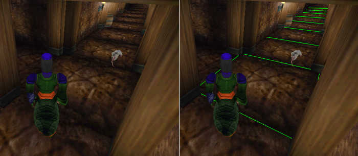
Below, the classic "3x3 tiles room". The tiles are same ones than the corridor one. (Camera view may alter perspective).
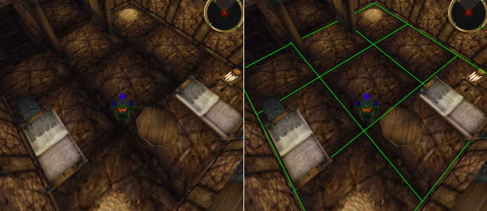
Below, a 4-tiles stair.
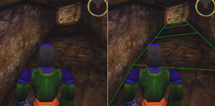
Sometimes the ground seems to have no tiles. In fact, there is some but the joints are well done and you dont see them. But, above, the roof comes handy to help you :o) Players dont look above their head enough, they should.
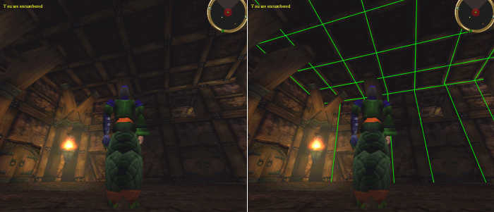
If both ground and roof show no tiles, you can "cheat" using light bugs. As you can see below, the torch light aura is cut by tile limit. As there is not torch on every walls, you can carry your own torch or an orb or any objects with light (like a simulacra shield).
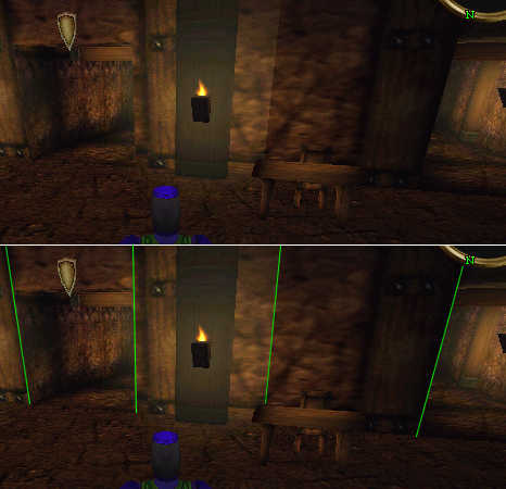
Easy so far, right ?
The Secrets of Elements
Elements are groups of tiles that will appear very often in every dungeons. Its a bit like molecules while tiles are atoms.
Look at this level of Arwic Mines. The dimensions seems quite random and complicated, but in fact its anything but random, and not complicated at all.
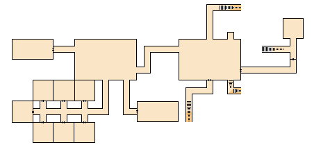
Every rooms, corridors, stairs, etc can be divided in tiles. You can see the classic 3x3 tiles rooms.
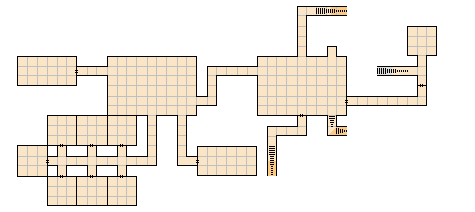
The whole level can also be divided in group of tiles (elements).
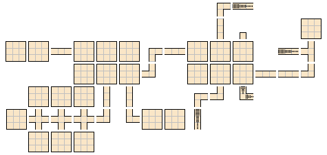
Here is a colored image to understand that only few type of elements are enough for this dungeon. Some element have to be rotated but its the same element.

And we can see that only 8 elements are needed to draw this dungeon level.

The number 3 is a key digit in dungeon cartography. Its our gold number ! If you study the above images you will notice that every elements are included in a 3x3 grid. If an element is in a 3x3 tiles area, no other element will be allowed in this zone... This is very handy to check proportion.

There is more elements of course, the additional ones most often used are:

The Secret of /LOC
The /loc or @loc is a great feature that will help in many cases.
Here is an example from the Sub:

The first 4-digits is the unique dungeon ID, here the Sub (or Abandoned Mine) is 01C9.
The next 4-digits is the landblock number. Places (even outdoor) is divided in square zones but its not useful for cartography.
The X-axis and Y-axis is your position in 2D.
The Z-axis is the height of your position.
The H-axis is the direction where u r looking (from 0 to 360°).
The XYZ axis may help you if u r not sure about the number of tiles in a long corridor or a big room. A tile is 3.3 coord units large. Below, you start at Y=-55 and if you move south for 3.3 until -58.3, you know you have walk one tile, etc... 3 tiles = 10 coord unit and as u know 3 is a gold digit here. So every 10*Y you walked 3 tiles.
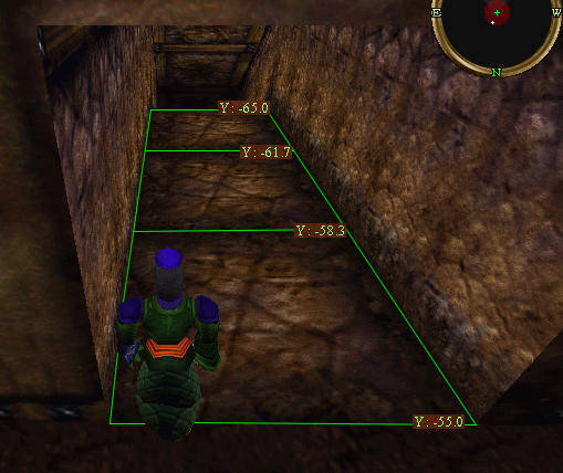
If you have a very long corridor with no clues about the tiles, you watch the /loc at the beginning and at the end and u divide by 3.3. Example : at the start of corridor u have Y=30.0 and at the end Y=50.0, you divide 20.0 / 3.3 = 6 tiles.
This is just a help, dont calculate everything or you'll get bored...
The Z-axis is far more helpful and used often to know at which level in the dungeon you are. It is critical when u go deep in a dungeon and then climb some stairs up, but as you have crossed so many stairs and slopes u dont really know at what level your char is. Usually, between two levels there is 3 tiles and u descend 6 Z-coord units. As you can see below, i am at Z=0.0 on top of stairs, and the pumpkin is at Z= - 6.0.
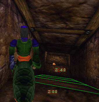
Again thats useful when u go down long stairs, and u dont see exactly the number of tiles. Just get the Z at start and the Z at the end and u will get an idea.
This said there is many exceptions, you may have 1, 2 or even 4-tiles stairs. Its not a problem as far as u know at which level you are.
Drawing on Paper
Once you have understood the principles of tiles and elements, its quite easy to draw a map on paper.
The very first map i did was on a blank sheet taken from my printer. Result was horrible (check the crapy map)... I understood quickly that, instead, i should use paper with grid. The common paper with grid has a fine 5x5 millimeter grid. Each tiny square on paper may represent a dungeon tile. Lets take again the Arwic Mines example
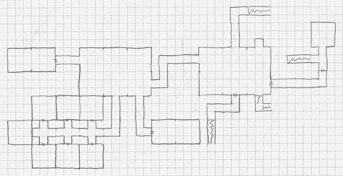
And here is the digital map (the digital map is based on a 10x10 pixels for a tile).

Drawing as a .gif .png Image
Now that your map is on paper, how to digitalized it as a .png image ?
There is no dedicated tool. We use any classic drawing software such as Photoshop, Paint Shop Pro or, like i do myself, with PhotoImpact (from Ulead). The most important feature that your software should have is the grid, to look like your paper map.
When you have the software, you should use 2 files :
1. A Reference File
(thx to Eskarina for this legend map)
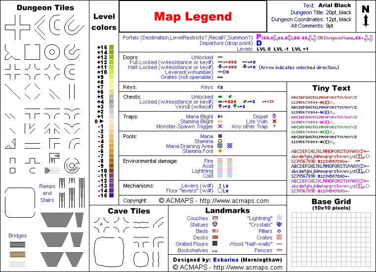
When you have saved this Map Legend on your PC, you should convert all the elements of the Dungeon Tiles section into selections. Then, you will be able to copy / paste the elements easily when building the map.
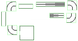
2. A Template File
This template is the basic ACMAPS structure for all maps.
All text should be selections for fast editing.
The footer may be modified according to each maps, but here is the most used legend for common dungeons.
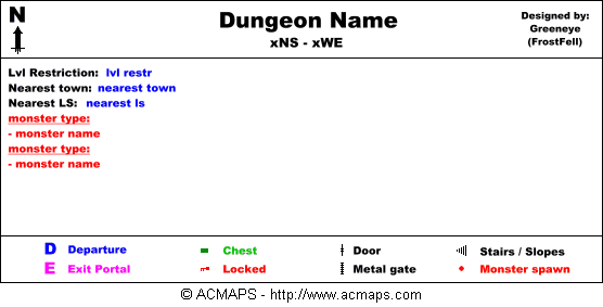
The template image above is the one i use myself.
So when i have filled all the infos (dungeon name, coords, lvl restriction, town, LS and monsters), i extend the template size if needed (in fact i use an very larger template because maps are now quite big, but the example has to fit this page :) ).

Then i copy / paste all the elements needed, from the reference file to the template file, some elements will need some rotating.

Then i set the grid (a software feature) to help when i will connect all the elements.
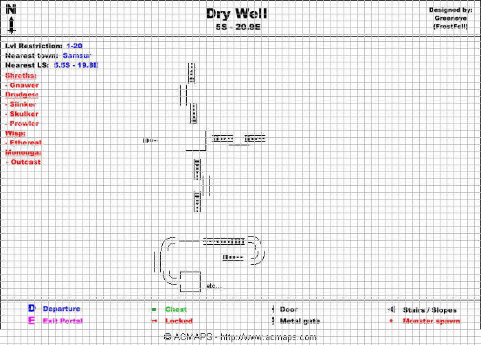
So placing the elements is very easy. (the grid dont alter the elements, its a layer above the drawing). Its best seen zoomed.
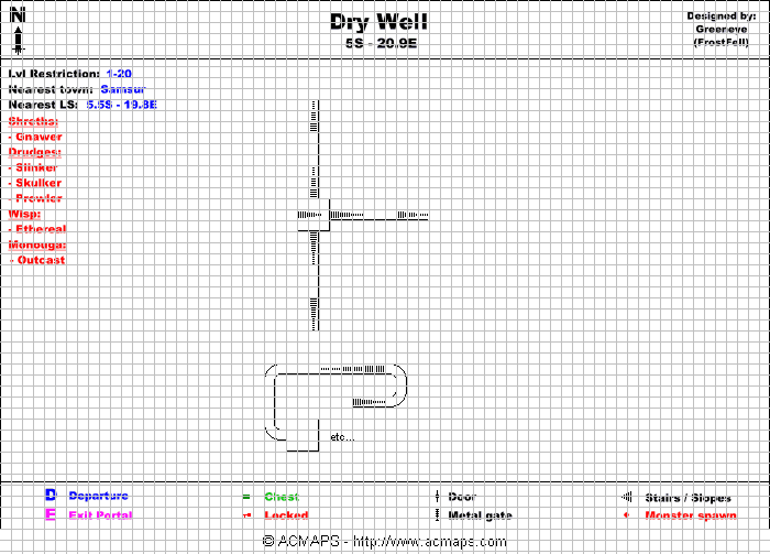
When the placement is done, i can remove the grid.
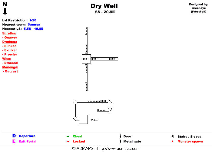
All this process is very fast when you got some experience, a few minutes.
But its not finished, when you will have placed all the tile elements, you will need to:
- Finish the connections (doors, etc),
- Fill the level colors,
- Place the objects (chests, pools, quest items, portals, traps, etc),
- Place the monster spawns,
- Label the levels (LVL 0, LVL -1, LVL -2, etc),
The Cartographer's Rules & Tips
Here is some rules that should be considered by ACMaps cartographers in order to provide nice maps. This may seems a bit strict rules but its based on experience (after 400+ maps) and some players' feedback.
1. If two levels dont overide, no cut
Dont try to make the map fill the space because its good-looking (square and small map). If possible, build it in the way the player will run it. The map is often used in-game and players dont have time to think at where this is linked with that. Of course this is in the case when its possible. Do it as much as u can. Else, cut.
| Good way to layout the map | Wrong way to layout the map |
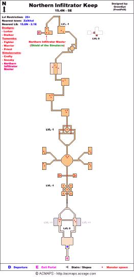
|
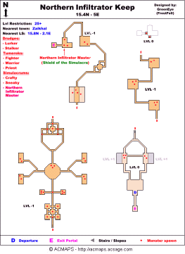
|
2. Level cuts at stairs only
Maps are easier to read if the levels are cut at stairs rather than anywhere else randomly. There is no reason at not cutting at stairs because two levels cant overide. If it overides, then you probably draw something wrong :)
| Good way to cut parts | Wrong way to cut parts |
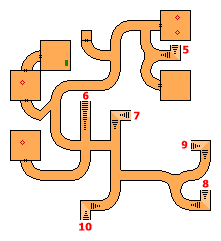
|
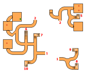
|
3. If you can jump, use dots
To let players know that they can jump from a level to another use dots rather than black lines.
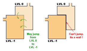
Also, if you need to partially draw a level under another one, use grey color.
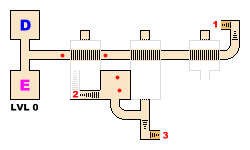
4. Monsters spawns where you meet them
Don't take too much time at finding where monsters are spawning exactly. Just note on the map where you meet the monsters, as it will probably be at the same location that players will meet them too.
5. LVL 0 is the start level, not z=0
The level where the dungeon portal brings you is the LVL 0, even if the /loc z axis is different than 0. Levels below are LVL -1, -2, -3 etc. Levels above are LVL +1, +2, +3, etc.
6. Cheat is allowed as a signature
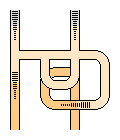
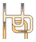
Sometimes, it appears it could be very useful for a corridor to be a bit longer than it is for real, because the map will be more clear : because it will prevent to separate two levels or prevent some ugly overriding. Then it is allowed to cheat a bit and draw the corridor 1 or 2 tiles longer. This should be an exceptionnal choice. As a side effect, this act as a signature because if someone steal your map and tries to publish it with different colors etc... then he will not be able to explain this bizarre part :)
| The curved orange pathway is overrided = ugly |
Cheat a bit and its more clear |
|
|
7. Separate maps for differents IDs
Sometimes, some dungeons are multipart separated with portals. If the dungeon ID is the same then all parts should appear on the same map. If its another ID, it should be on another map."